Monday, February 28, 2011
shut your pie hole (and other MYOB cards)
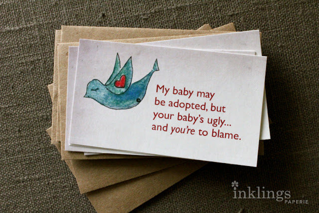
A dear friend of mine (let's call her "Sassy") and her husband have chosen to grow their family through adoption. Recently, Sassy posted the following message on her Facebook: "I love these cards! I needed them last week when a cashier asked me, "What happened to his mom? Did she just leave??" Her post was accompanied by a link to the cards immediately below by artist and adoptive parent Jodi Queenan: (To my designer friends, please excuse the indiscretionary use of Zapfino. This post gets better, I promise...)
My immediate response to Sassy, who I have named appropriately, was that she needed something a little "sassier." If you know Sassy, you'd understand that cards with birds, hearts, and kindly-phrased sentiments on adoption would not be the first thing she might dole out to a prying cashier. I decided to whip together some modified cards for her (not available for sale – please note that these are intentionally designed to look like the original cards by Jodi Queenan, and I am in no way claiming creative license to them). Because truthfully, getting Sassy to laugh is on my weekly bucket list.
Behold, I share with you the Sassy-inspired "MYOB" cards... complete with grocery bag mini envelopes to discretely hold (and seal) your special message while you make your exit. With a smile on your face.
All of this has of course gotten me thinking about a whole line of passive-aggressive notes that could be handed out in similar situations by not only adoptive parents, but by parents with large families ("Are they ALL yours!?"), mothers of children with abnormally large heads ("Did you deliver him naturally? Once you've had a baby like that, you're NEVER the same..."), and of course to parents who insist on showing off their extraordinary parenting skills while your toddler chooses to forget his words and simply grunt ("Haven't you heard of the Elimination Communication Method? Our Anabelle has been potty-trained since she was THREE months old!). Myself, I've personally found myself in two out of three of these scenarios: I have just one child who looks like Charlie Brown, and still wears diapers at 2 years old.
What about you? If you could have a passive-aggressive note on hand, what would it say? Who would be the lucky recipient? Please share your comments... the lucky winner(s) may receive custom notes of their own. Grin.
Saturday, February 26, 2011
stina persson
I couldn't wait to share these absolutely stunning watercolor pieces by Swedish artist and illustrator Stina Persson. Her sense of color and white space are phenomenal, with organic shapes growing out of the human form. Thanks to a good friend of mine for sending Stina's name my way... I'm feeling totally inspired by her work this week. Which is perfect, because as I'm looking out my window, all I see is white snow and a whole lot of slush.
Wednesday, February 23, 2011
guess whooo!
Guess whooo's having a baby? (hint: it's not me!)
My good friend Jeanne is having her first baby this June. I may not be much of a baker, but I can make a mean baby shower invitation. I decided to have some fun with the scratch-offs and woodland creatures. Each of the invitations requires the recipient to scratch the tree stump to reveal who the shower is for. They were mailed in gorgeous chocolate brown envelopes from Paper Source with a shiny penny inside for scratching!
Isn't this cream felt-finish paper gorgeous? It handled the ink beautifully, and gave the invitations a lovely, natural quality. Delish!
As for the cupcakes, I'll be commissioning the ever-so-talented Diana Gawet from DG Cupcakes to make these charming treats. I can't wait to see them!
Have a hoot today!
Tuesday, February 15, 2011
the shoe shine guys
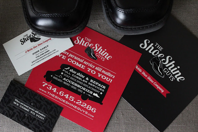
I'm excited to share a hot-off-the-press project I've done for The Shoe Shine Guys, a new business that a client of mine is launching! The Shoe Shine Guys are a full-service, mobile shoe-shine shop that will soon be bringing their personal services to office buildings in Southeastern Michigan.
Through my design business (Landgraff Design Group), I help my clients build strong, memorable brands. I've worked with some fabulous companies, churches and non-profit organizations. With that said, it's not everyday that a start-up comes to you with the complete package: a great concept, phenomenal business sense, and an understanding of how branding and strategic design are perhaps the most essential tools to invest in as you're starting a company.
The Shoe Shine Guys were that kind of client, and approached me to help them build their brand from the ground up. After learning more about their business and target clientele, I realized that there was a great opportunity to tap into the rich heritage of the shoe shine business. There is a certain vintage charm that is found in shoe shine tins, packaging, and turn-of-the-century signage that has proven to be a great source of design inspiration during the course of this project! John Early and his team truly are a delight to work with, and I'm proud to share some of the progress made so far.
Their final logo, business cards, and sweet 5" square postcards feature an eclectic use of type and pattern that are both nostalgic and contemporary. A spot UV varnish brings an extra richness to their printed materials (not to mention shiny shoes and a fun custom pattern I created for them), making each piece feel special and premium. If you're looking for a way to make your printed communications pop, try working with your designer to experiment with spot UV varnish. This special process places the varnish over a specific area in your design, causing it to catch the light and shine. It's like bling for your paper!
Look out for the Shoe Shine Guys near you as their truck makes their scheduled stops at office buildings in the Metro Detroit area this spring! You won't be able to miss their jet black truck, nostalgic graphics, and smiling faces as they work to make the Detroit area shine!
Monday, February 14, 2011
love: scratch that
Happy Valentine's Day!
I'm always looking for fun new things to do with paper. Special occasions provide the perfect opportunity to stretch my creativity ~ and my dollar. Below is a gift I've made for my hubby in the form of a scratch and win game (red petal enclosure courtesy of Paper-Source). I'm no lottery player, so I made up my own rules. Roll the dice, and scratch the corresponding number. Continue rolling until all have been uncovered. Simple, I know. Don't judge.
What's great about these scratch-off stickers that I've recently discovered is that you can design anything you wish, and then stick them over top to conceal the answer. And let's be honest: who can resist a scratch-off?
This has sparked all SORTS of ideas in my lil' creative mind. So while Mark will be fast asleep and dreaming happy dreams about his "winnings," I will inevitably be laying awake thinking about how to apply this newfound discovery to my paper goodies!! ((wink))
Saturday, February 12, 2011
Alma's secret
A few years back, this postcard caught my eye in an antique store. While I don't frequent antique stores on a regular basis, occasionally I'll wander in... and am always drawn to the postcards. There's something about the stories that each one of them carries from another time or place. This little gem was no exception.
Aside from the charming design that initially caught my attention, I happened to turn it over and find this phrase: "Please don't show this to no one." The front is signed by a girl (woman?) named Alma. When I hold this postcard, I can't help but wonder, what was Alma's story? Who was the subject of her affections? Did she ever have the nerve to give it to him? If so, did he keep the postcard for years and years? And how did Alma's secret end up stuffed in a box in an Antique store in Dearborn, Michigan? And then in an ironic twist of fate, posted on a blog and available for the world to read... or at least the five or six of you who read this? (I love you, mom!)
There's a certain charm in holding a letter that was once held by another that's lost in an e-mail. I'm a strong believer that the power of the handwritten note is alive and well. That perhaps they are even more cherished now than ever before, because it's so much easier to type a message and click "send." Guilty as charged.
A year or so back, I resolved to write one note a day to someone with an encouraging word or a little "hello." This was ambitious, I know. And you can probably guess how long that lasted before my common sense got the better of me. But maybe one note a month is more realistic. That's twelve possible cards that could one day end up in a little store somewhere, in the hands of some other paper lover who might get some crazy idea to do the same thing.
P.S. At the end of this blog is a large version of Alma's postcard (blank) for you to send to your sweetheart!
Thursday, February 10, 2011
skinny jeans and frozen locks
It was a cold, cold morning here in Michigan, and my car locks froze overnight. Being the resourceful person that I am, I climbed in through the trunk. I am now sitting at work hoping that said locks are not frozen at the end of the workday. But if you do happen to see a pair of high-heels and skinny jeans flailing out the back of a hatchback, do not be alarmed. It is not an abduction taking place. It's just me getting into my car.
Monday, February 7, 2011
Inklings DIY: Wipe-off Memo / Menu Board
Hello!
One of the goals I've had with this little blog is to share some DIY ideas on using paper to organize, inspire, and beautify the everyday.
Let me preface this by saying that I am not a meal planner. I'd like to say that I shop and cook as they do in Europe: buy ingredients the day of, finding inspiration in what looks freshest and in season. But most often, my "European Market" translates to which take-out restaurant is first on my speed dial. While other mothers were proudly sharing recipes on what home-made baby food their youngsters were benefiting from, I was racking my brain for what chef Gerber had in store for my little guy during the drive home from work. Which leads to my first official Inklings D.I.Y which, though it is somewhat self-serving, I hope will spark an idea in you as well.
White boards? They belong in an office, plain and simple. Chalk boards? Charming, but messy. Here's a great little wipe-off memo board that you can make out of any picture frame:
What you'll need:
Option 1: Use a printer
For the insert above, I designed it on my Mac and printed it on my Epson large format printer. Don't have a large format printer? No problem. Print the above template at a smaller size, or design a similar one yourself in a size that will fit your frame. I designed this one so it wouldn't a toner guzzler because I'm shamelessly practical. Most of the time. If you want a darker background, go with Option 2.
Option 2: Use scrapbook paper
Choose a background paper, and write your days directly on the paper. You can use any paper you want in the frame, but keep in mind that you want your whiteboard marker to show up against it. Large patterns with high contrast are not recommended. To get the look above, choose two coordinating papers. One will become your background, and one will be for your days. Tape loops will hold everything in place until you've sandwiched them behind the glass. Voila!
What I love about this is that it's easy to change up the look if you get tired of it. Just find (or print) a new piece of paper, stick it in the frame, and you've created a whole new look.
This is one menu board that I don't mind hanging in my kitchen, and it's found its home next to my fridge. So I have no excuses. Unless, of course, I have a particularly rough week. In which case, It will read, "order in; order in; take out; date night..."
One of the goals I've had with this little blog is to share some DIY ideas on using paper to organize, inspire, and beautify the everyday.
Let me preface this by saying that I am not a meal planner. I'd like to say that I shop and cook as they do in Europe: buy ingredients the day of, finding inspiration in what looks freshest and in season. But most often, my "European Market" translates to which take-out restaurant is first on my speed dial. While other mothers were proudly sharing recipes on what home-made baby food their youngsters were benefiting from, I was racking my brain for what chef Gerber had in store for my little guy during the drive home from work. Which leads to my first official Inklings D.I.Y which, though it is somewhat self-serving, I hope will spark an idea in you as well.
White boards? They belong in an office, plain and simple. Chalk boards? Charming, but messy. Here's a great little wipe-off memo board that you can make out of any picture frame:
What you'll need:
• Picture frame (any size will do – mine fits an 11 x 14" frame)
• Whiteboard marker (available at any office store)
• Patterned or plain paper for the background (or print out the picture above; click on the image to expand)
• Sold-colored paper to write out days on left (optional)
Option 1: Use a printer
For the insert above, I designed it on my Mac and printed it on my Epson large format printer. Don't have a large format printer? No problem. Print the above template at a smaller size, or design a similar one yourself in a size that will fit your frame. I designed this one so it wouldn't a toner guzzler because I'm shamelessly practical. Most of the time. If you want a darker background, go with Option 2.
Option 2: Use scrapbook paper
Choose a background paper, and write your days directly on the paper. You can use any paper you want in the frame, but keep in mind that you want your whiteboard marker to show up against it. Large patterns with high contrast are not recommended. To get the look above, choose two coordinating papers. One will become your background, and one will be for your days. Tape loops will hold everything in place until you've sandwiched them behind the glass. Voila!
What I love about this is that it's easy to change up the look if you get tired of it. Just find (or print) a new piece of paper, stick it in the frame, and you've created a whole new look.
This is one menu board that I don't mind hanging in my kitchen, and it's found its home next to my fridge. So I have no excuses. Unless, of course, I have a particularly rough week. In which case, It will read, "order in; order in; take out; date night..."
Subscribe to:
Posts (Atom)